

Follow these guidelines when you feature Sei in marketing communications, advertising, articles, websites, partner materials, and any printed assets.Download the full brand kit: sei-brand-assets.zip · Full interactive version at brand.sei.io
01 — Logo
Primary logo
The Sei primary lockup has two elements: the symbol and the wordmark. This lockup is the main representation of the brand. Use it consistently as a combined unit.

Symbol
The symbol is the standalone Sei mark. Use it on its own only when the wordmark is already established elsewhere on the surface (for example, favicons, app icons, and watermarks).

Token
The token mark appears in Maroon. Black and white are fallbacks for constrained environments.
Powered by Sei
This lockup is for ecosystem and partner surfaces. Keep the lockup intact, and follow the clearspace rules.











02 — Color
Color
Black and white carry the brand. Maroon and Gold are heritage accents. Use them only for emphasis and legacy moments, and never as the base palette.Primary palette
Base Color
Black
#000000
Base Color
White
#FFFFFF
Headlines · CTAs · Accents
Maroon
#600014
Data stats · Highlights
Gold
#966F22
Neutral ramp
White
#FFFFFF
25
#F5F5F7
50
#CCCCCC
100
#999999
200
#666666
400
#333333
600
#131313
Black
#000000
03 — Typography
Primary typeface
Lateral is our primary typeface. Use it for headlines, product UI, and anything that needs presence. Give it room in editorial layouts.Lateral
ABCDEFGHIJKLMNOPQRSTUVWXYZ
abcdefghijklmnopqrstuvwxyz
0123456789 .,:;!?&@*
Condensed Bold · DisplayRegular · BodyLight · Subtext
Primary font · Headlines · Body · Copy
Secondary typefaces
Items Text
ABCDEFGHIJKLMNOPQRSTUVWXYZ
abcdefghijklmnopqrstuvwxyz
0123456789 .,:;!?&@*
Secondary font · Editorial · Quotes · Foundation
ABC Repro Mono
ABCDEFGHIJKLMNOPQRSTUVWXYZ
abcdefghijklmnopqrstuvwxyz
0123456789 .,:;!?&@*
Tertiary font · Data · Tickers · Captions
04 — Usage
Clearspace
To keep the logo clear and prominent, follow the clearspace guidelines. Leave the required space around the lockup. This space stops surrounding artwork, imagery, or the edge of a page from crowding it.
- Use only approved colors. The approved colors are black, white, Maroon 100, and Gold 100.
- Keep proportions locked. The symbol and wordmark ship as one unit. Do not change their relative scale.
- Respect clearspace and minimum size. Leave a clearspace of X on all sides. The minimum height is 25 px.
Cobranding
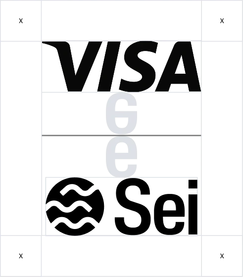
Our lockup for brand partnerships follows the clearspace rule. Apply the same rule to the partner brand. Make sure that both lockups are the same height.
If you need something that is not listed here, see the full interactive brand site at brand.sei.io. You can also download the complete brand kit zip.